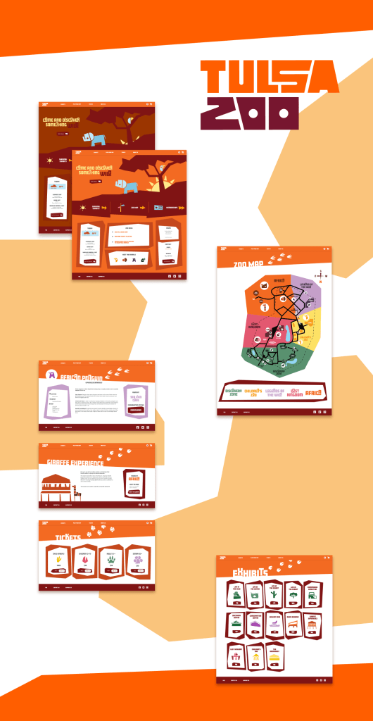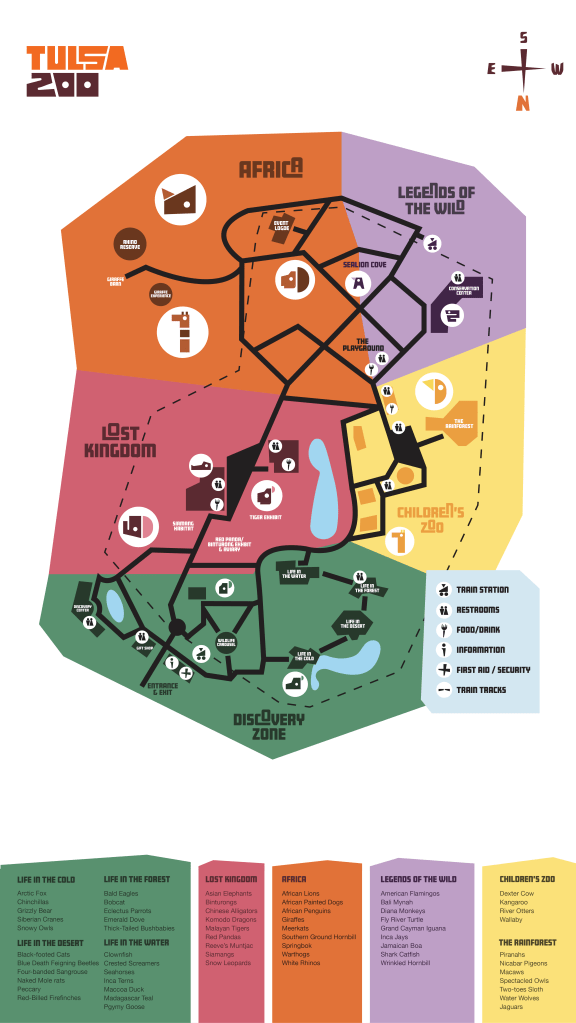

Tulsa Zoo is a zoo focused on recreation, education, and conservation. It is about cultivating an environment for all to enjoy and explore. The design is for people wanting to learn, no matter their age. It is playful while still remaining structured. The website will be used prior to arrival to ease the experience once they arrive. From finding their favorite animal to locating the First Aid desk, the map will be used as an aid throughout the park.
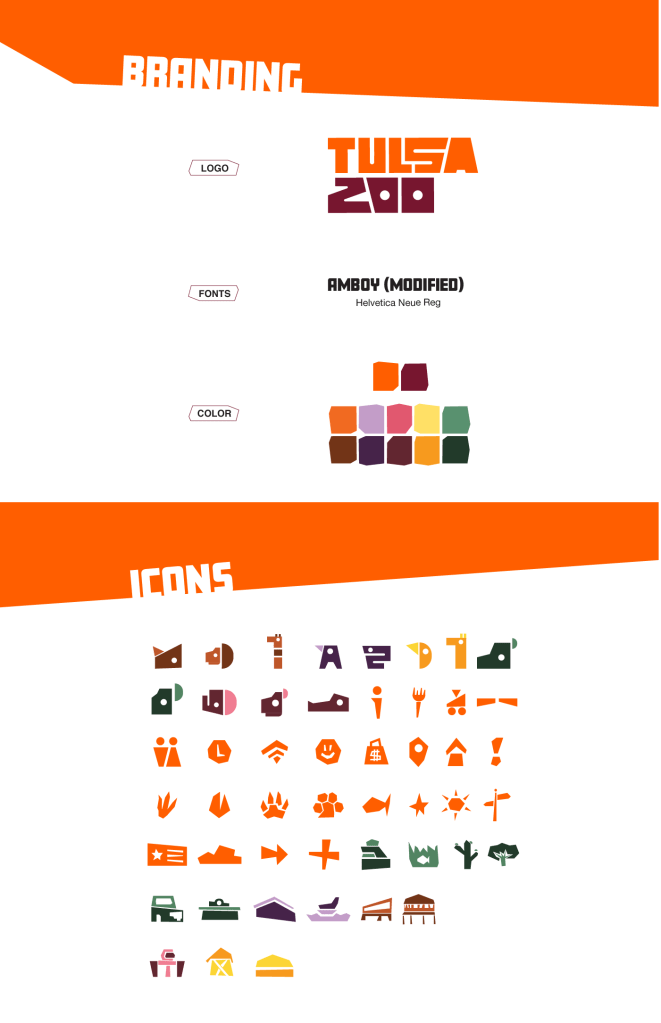
For the Tulsa Zoo, choosing to go with a geometric illustration form allows the brand to be bold and set apart. These forms allow the brand to be young, without targeting children too much. Focusing on the whole family was a main goal. The primary word mark is blocky with some unusual forms to create variety. The word mark was a literal building block for the extensions. These letter forms were taken and used to build the icons for the animals. It was carried throughout the map and the website. The map makes use of the animal icons and other identifier icons.
https://xd.adobe.com/view/39162392-5ac4-4ca0-ac5d-2dee4cb15865-6c45/?fullscreen